
The Print Field / Essay 14
Large Wood Type Beyond Metal
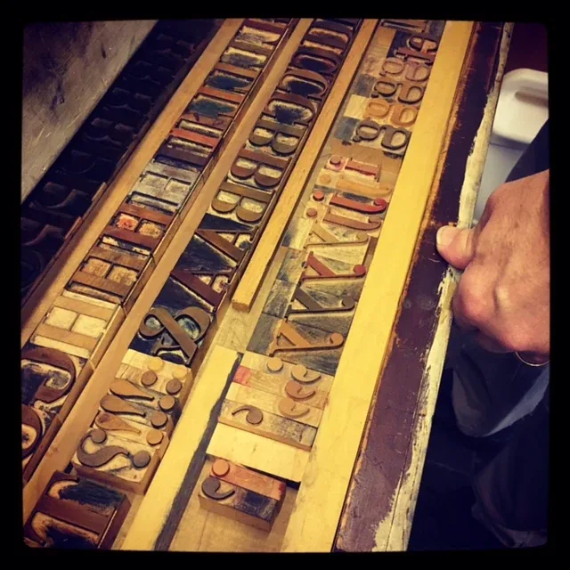
The wooden “Bodoni” type in this cover is identified in its Commons file record as a 120-point wood typeface. Rochester Institute of Technology’s Cary Graphic Arts…
Why large letters needed another material
The wooden “Bodoni” type in this cover is identified in its Commons file record as a 120-point wood typeface. Rochester Institute of Technology’s Cary Graphic Arts Collection explains the material problem behind large display type: casting very large metal letters could produce uneven faces as the metal cooled, while wood was lighter and more workable at scale. The collection notes that characters were initially carved by hand and that Darius Wells engineered a lateral router in the 1820s to make larger wood type letters in greater quantities.
The point size in the file title gives the type’s body scale, not necessarily the height of the printed impression. Point systems describe the body that supports the face, and type foundries could interpret display sizes with different proportions. The record is a useful clue, but a precise dimensional description should be tied to a measured specimen or museum catalog. The larger story is that wood allowed printers to use letters too large or impractical to cast as ordinary metal type.
A router changes the work
The lateral router helped make large wood type reproducible. RIT describes Wells’s machine as a way to mass-produce wood type letters, creating an American industry in oversized relief blocks. This did not eliminate handwork. Designing a letter, preparing the pattern, choosing stock, cutting the face, and finishing the block still required knowledge and labor. The router changed the scale and repeatability of one part of the process.
Wood type was not simply a larger version of metal type. Its material and manufacture shaped what kinds of forms were practical. Large letters could be used in posters, signs, and other work meant to be read at a distance. Their faces could be broad, condensed, ornamental, or deliberately unusual. RIT’s collection emphasizes the variety of forms in its specimens, which show how wood type expanded the expressive range available to printers and advertisers.
The letter is a relief object
Wood type is a relief printing surface: the raised face receives ink and transfers it to paper. That shared logic connects it to other raised blocks while its typographic purpose distinguishes it. A letter has to work within a word, line, and page. The printer must orient it correctly, fit it into a composing arrangement, and lock it so that the face stays level with surrounding type. A single large sort can dominate the composition, so its relationship to spacing and adjacent letters becomes part of the design.
The block also has a different physical presence from a small metal sort. Its mass can affect how it is handled and stored, and the wood’s condition matters to printing. A worn or damaged face may produce an irregular impression. An old specimen can show traces of use, but the appearance alone does not reveal how often it was printed or which job it served. That requires provenance and shop records.
What a specimen proves
RIT’s online selection includes nineteenth-century wood type examples and notes that the Cary Collection holds more than five hundred fonts. A specimen lets readers compare letterforms that might otherwise be flattened into a font name or a digital image. It can show the physical face, the range of a font, and the effect of printing from the original block. It does not automatically document the commercial context in which each font was used.
The modern view of wood type often emphasizes its texture and irregularity. Those qualities may be present in a particular impression, but they should not be romanticized as the only aesthetic purpose. Printers used large type because scale was necessary for a message, and wood offered a workable way to make that scale printable. A typeface could be decorative and functional at once. The material was a response to manufacturing constraints as well as a medium for design.
Body size is a constraint, not a promise about appearance
The 120-point label attached to the Bodoni wood type is an invitation to compare two dimensions that are easily confused. Body size belongs to the physical support used in composition. The visible letter occupies some portion of that support, and its apparent size also depends on proportions and surrounding space. Two faces on equal bodies can therefore make quite different claims on a poster. The label helps locate the object within a working system; it does not substitute for looking at the printed face.
RIT's account describes difficulties with casting especially large metal type, including sizes above 240 point. It would be a mistake to turn that discussion into a claim that the pictured 120-point letter could only have been made in wood. The historical argument concerns a material advantage across display typography, not an absolute boundary established by this specimen. Wood offered a productive route to scale and variety; the particular block records one choice within that route.
For a designer, the useful comparison is between the letter as a stored object and the letter as a printed shape. A broad face consumes space differently from a condensed one, even when a nominal size sounds similar. That relationship makes the material history relevant to composition: changing the manufacturing possibilities enlarged the range of shapes a printer could arrange. The specimen's value lies in connecting that range with an actual relief block, rather than treating its point size as a complete description of what a reader sees.
Further reading
Sources & records
Linked records provide object descriptions and historical context. Comparisons, close readings, and explicitly hypothetical examples are editorial analysis. This essay was revised on 22 October 2026; it does not report first-hand workshop research. The image source and license appear in its caption.
The Composing Stick, Line by Line
The composing stick is a small tool with an outsized role: it holds one line of type while a compositor assembles words from individual sorts. The Library of…
5 min read
The Type Case as a Shop Index
A printer’s case is not a decorative box of letters. It is a working storage system that determines how a compositor reaches the type needed for a line. The cover’s…
4 min read
Inking with a Hand Roller
The cover reproduces an illustration of a composition hand roller from an American Type Founders catalogue dated 1906, as identified in the source file. The file…
5 min read