
The Print Field / Essay 39
Alan Kitching’s Braque
The square image is a letterpress typographic artwork by Alan Kitching, titled in the file description with a line about silence and Braque. Kitching's own shop…
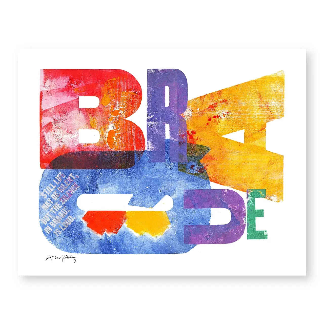
A letterpress artwork carrying Braque's name
The square image is a letterpress typographic artwork by Alan Kitching, titled in the file description with a line about silence and Braque. Kitching's own shop lists a work called Braque, and the digital file is contributed by the account AlanKitching, which declares it own work with a CC BY 4.0 license. This is not a Georges Braque print. It is a contemporary letterpress composition by a typographic artist that invokes Braque through its title and verbal framing.
That distinction matters because the word “Braque” can point to different things: an artist, an art-historical reference, or the name of a later work. A viewer should identify the maker from the object record before drawing conclusions from the title. Here, the visible language itself becomes part of the visual field. Typography occupies the square as both readable text and printed form.
Letterpress turns letters into shapes
In letterpress, raised type or another relief surface is inked and pressed against paper. Letters have physical bodies, faces, and spacing; they can be arranged to create words and also to build rhythm, weight, and texture. Kitching is described by the University of the Arts London collection as a practitioner of letterpress typographic design and printmaking, known for expressive use of wood and metal letterforms. That context helps explain why a phrase can operate as an image as much as a sentence.
The file's caption attributes the artwork to Kitching and dates it to 1 March 2023. The date is attached to the file's artwork information; it should be reported with that provenance rather than confused with a publication or exhibition date. The Commons page records an own-work declaration from that account and identifies it as a letterpress typographic artwork. His shop's product listing supplies the concise title Braque. Together, those sources anchor the interpretation without turning a caption into an unsupported production history.
The sentence gives silence a visual weight
The text associated with the image says that still life may be silent while Braque's silence is loud. The sentence places a paradox at its center: a still-life image has no voice, yet the composition can feel forceful. In a typographic print, the words are not simply a caption under a picture. Their size, spacing, and arrangement can make the idea of silence occupy the page.
The phrase also invites a connection to Georges Braque's still-life work, but that connection should be described as an invocation rather than a direct quotation from or artwork by Braque unless a source supports a stronger claim. The print's title and sentence supply a reference. The viewer can decide how the visual form handles that reference by looking at the type, color, and spacing in the reproduction.
The square is a composing surface
A square frame creates a different balance from a tall poster or a wide newspaper column. It gives the typographer a fixed field in which words can be stacked, broken, repeated, or surrounded by space. The letterforms can create dark masses; the paper can provide pauses. Even when the phrase is readable, the eye also registers typographic density and contrast.
Letterpress makes those arrangements physical. Wood and metal type are separate objects that can be moved, spaced, and inked. The impression transfers the assembled design to paper. Kitching's broader practice, as documented by University of the Arts London and his own portfolio, uses letterforms as expressive material. That general context is relevant, but it does not tell us the exact typefaces, colors, press, or edition size used for this particular work. Those details would need a dedicated work record.
A print about another artist is still its own object
Artworks frequently refer to earlier artists or ideas. A letterpress work can respond to a painting, an art-historical phrase, or a visual tradition while remaining a new composition. The title Braque establishes a reference point, and the sentence about silence supplies a conceptual link. The physical work belongs to Kitching's practice and the date in its file record.
This distinction helps avoid a common cataloguing error. A page title that includes a famous artist's name does not mean the famous artist made the work. Likewise, a phrase connected to one artist's writing should not be presented as a verified quotation without a source. The safe description is clear about authorship and careful about the nature of the reference.
Read the sentence once, then read its arrangement
Kitching's Braque offers a productive separation between verbal meaning and typographic emphasis. A sentence can be paraphrased without preserving its line breaks, proportions, or position on the sheet. A typographic artwork makes those arrangements part of the experience. The useful comparison is therefore between what the words say and how the eye is asked to encounter them. Neither reading is complete on its own.
Try summarizing the statement about still life and silence in ordinary prose, then return to the reproduction. Which words become visually prominent? Where does the arrangement delay or accelerate the reading? These are questions for the printed composition, not evidence that the phrase is an authenticated quotation by Georges Braque. The work invokes his name; its documented maker is Kitching. The distinction prevents reference from being mistaken for authorship.
The Commons page identifies a contribution by the account AlanKitching and labels it own work. That is the record's attribution, not independent verification of the account holder's identity. UAL's account of Kitching's letterpress practice provides a separate institutional context. Together they allow the article to identify its sources while concentrating on a specific critical problem: typography can make a sentence both readable and spatial. The original interpretation lies in explaining the gap between paraphrasable meaning and the experience of an arranged print, rather than merely repeating the artist's words or borrowing the authority of the famous name in its title.
Further reading
Sources & records
Linked records provide object descriptions and historical context. Comparisons, close readings, and explicitly hypothetical examples are editorial analysis. This essay was revised on 22 October 2026; it does not report first-hand workshop research. The image source and license appear in its caption.
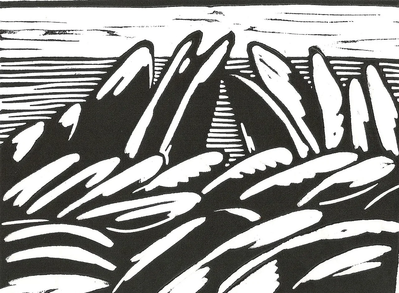
Rocks in Bretagne
The Commons object description identifies Ingeborg Bernhard's linocut as *Rocks in the Bretagne, France*, dated 1977, with dimensions of 21 by 30 centimetres. The…
5 min read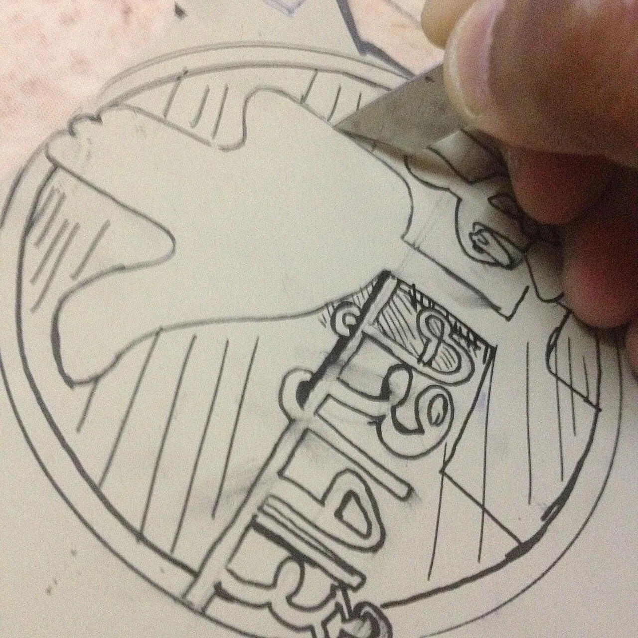
Carving a Chandigarh Stamp in Linoleum
The photograph shows a sheet of linoleum being carved for a stamp. Its caption identifies the design as a stamp featuring Chandigarh's Open Hand Monument, the Rock…
5 min read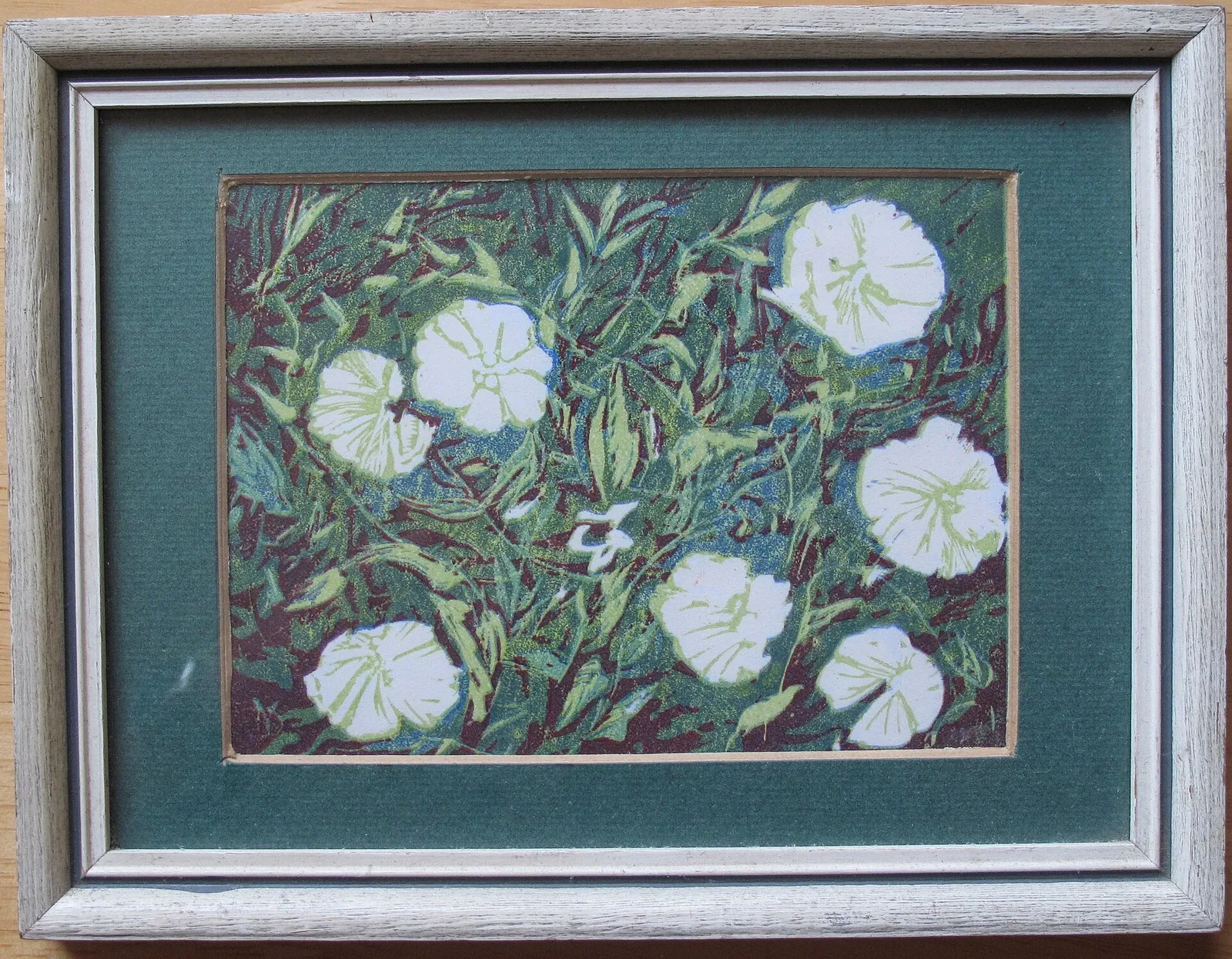
Yvonne Drewry’s Convolvulus Linocut
The Commons file record identifies this image as a linocut of convolvulus flowers by Yvonne Drewry, dated 1975. The photographed impression is the starting…
5 min read