
The Print Field / Essay 22
Registration in a Two-Colour Linocut
A two-colour linocut is not simply a black-and-white print with a second ink added at the end. Each color depends on a carved surface, an inking decision, and a…
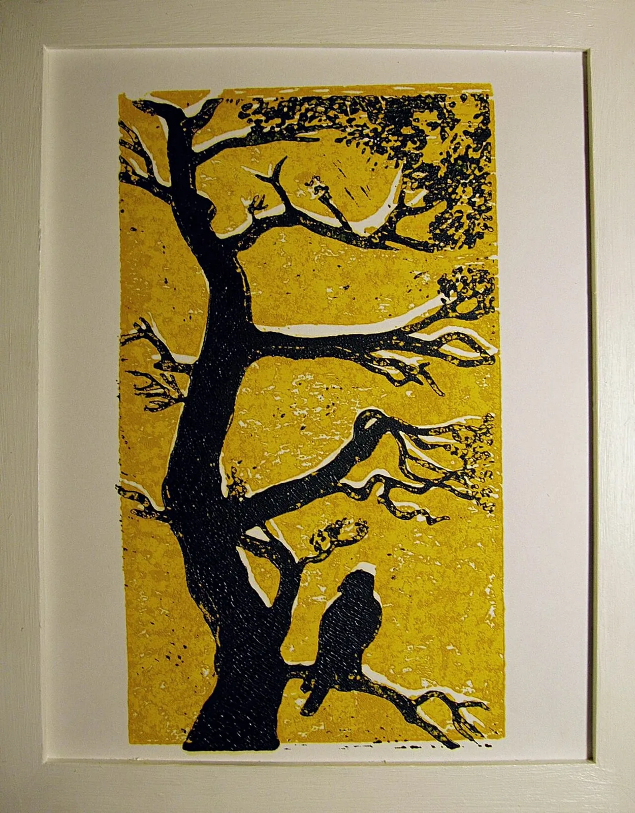
Two colors mean two meetings with the paper
A two-colour linocut is not simply a black-and-white print with a second ink added at the end. Each color depends on a carved surface, an inking decision, and a meeting between block and paper. The pictured print by Ivo Kruusamägi is identified in its Commons record as a two-colour linocut made to illustrate the technique. Its teaching value lies in its visible layers: the viewer can compare where colors meet, where one sits beside another, and where an unprinted area remains part of the design.
The underlying process belongs to relief printing. A cutter removes parts of the linoleum surface; the raised portions take ink and print. A second color requires another printing pass, another block or a carefully planned reduction of the same block, and a way to bring the paper back into the correct position. Registration is the practical problem of aligning those parts so that a line or color lands where the artist intended.
The paper has to return to a known place
On a multi-colour job, a sheet that shifts between passes produces visible misregistration. The amount of error that matters depends on the design. A narrow gap may reveal a white sliver; overlapping colors can create a third hue; a broad, tolerant shape may disguise a small shift. The printmaker plans for these possibilities before cutting. Registration marks, pins, a jig, or a consistent paper edge can help control position, but the exact method depends on the artist's setup and equipment.
The illustrated print should not be treated as documentation of a particular registration system unless its artist or source record says so. What it does demonstrate is a two-colour result. Close looking can help a student ask where colors overlap and which lines define their boundaries. A workshop demonstration or artist statement can explain how those alignments were achieved.
Separate blocks, shared composition
With a separate-block approach, each block carries one color's shapes. The artist must plan the relationship between the blocks. A common outline can organize the image, or one color can overlap another to produce a new visual field. Cutting one block for each color offers flexibility, but it requires the paper to be registered for each pass. If the second block is carved after the first has already been printed, the shapes must still be planned against the same image boundaries.
The colors also need to dry and behave appropriately. Ink can change as it is rolled, transferred, and layered. Paper absorbs and stretches in response to moisture and handling. A very absorbent sheet may respond differently from a coated one. Artists working by hand may pull proofs and adjust pressure, ink quantity, or sequence. None of these variables is resolved by selecting a color palette alone.
Reduction printing asks a different question
An artist may use one block and cut away more material after each color pass. This reduction method makes the image cumulative: once an area is removed, it cannot be restored to the original surface. The printmaker must decide the order of colors and preserve the surfaces needed for later stages. The edition is tied to that block's progressive transformation. This is distinct from a two-block process, even if the finished image looks similar.
Because the cover record identifies Kruusamägi's image as a two-colour linocut but does not specify the precise block strategy, this essay does not assign one. That restraint matters. Technique labels are useful, but not every technical detail is visible in an image. The artist's account or a documented printmaking demonstration is needed to distinguish a separate-block edition from a reduction print with confidence.
Color boundaries carry structure
Two colours can divide a composition, establish depth, or make a small printed image legible from a distance. They can also make the act of registration more visible. If an edge is doubled, the viewer sees the relationship between printing passes. A slight offset may be intentional, accidental, or introduced by reproduction. Before calling a print “misregistered,” check whether the edge is actually a registration failure or a deliberate part of the composition.
The challenge for a student is to read the whole image rather than hunt for a technical mistake. Where does the eye travel first? Which color carries the largest shape? Do the colors meet, overlap, or leave a strip of paper between them? What parts of the design would change if one color were removed? These questions connect mechanics to visual decisions.
A boundary can tolerate error or expose it
Two-colour registration is also a problem of design sensitivity. Consider two hypothetical arrangements using the same pair of inks. One places a narrow colored line directly inside a matching outline; the other uses broad overlapping fields. An equal shift of the paper would have very different visual consequences. The first might reveal a conspicuous sliver, while the second might change the width of an overlap without breaking the composition's main structure.
This comparison explains why calling a print accurately registered requires a reference to its design. Measurement alone does not tell us which displacement would matter to the image. A small shift can destroy a precise alignment, while a more open arrangement may accommodate visible variation. That does not establish whether the pictured Kruusamägi print contains intended or accidental offsets. Its record identifies a teaching example of two-colour linocut, not the artist's entire registration procedure.
For a student, a useful paper exercise would separate the two imagined color fields and then consider which edges must agree exactly. The exercise adds a planning question before any carving: where does the composition demand close coincidence, and where can paper or overlap carry the boundary? It relates technique to a visual decision instead of treating registration as a universal contest for microscopic sameness. The finished print then becomes evidence of coordinated layers whose relationships matter in different ways across the sheet.
Further reading
Sources & records
Linked records provide object descriptions and historical context. Comparisons, close readings, and explicitly hypothetical examples are editorial analysis. This essay was revised on 22 October 2026; it does not report first-hand workshop research. The image source and license appear in its caption.
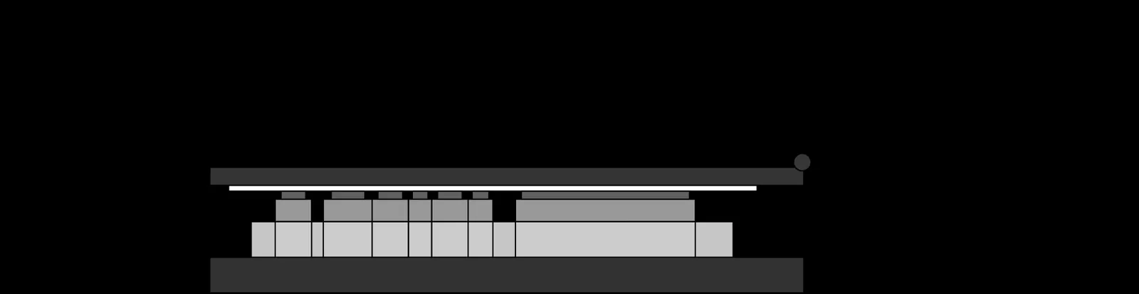
Flatbed Letterpress Anatomy
A flatbed letterpress diagram turns an industrial machine into a set of relationships. The bed holds the locked type or relief forme. The ink system prepares the…
5 min read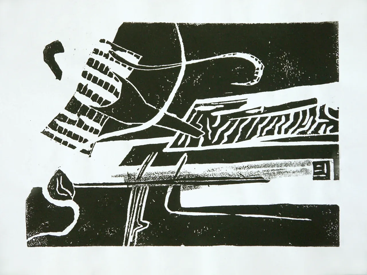
Fons Heijnsbroek’s Linocut Still Life
The Commons record describes this 1988 linocut as an untitled abstract still life by Dutch artist Fons Heijnsbroek. Those details are enough to guide a first…
4 min read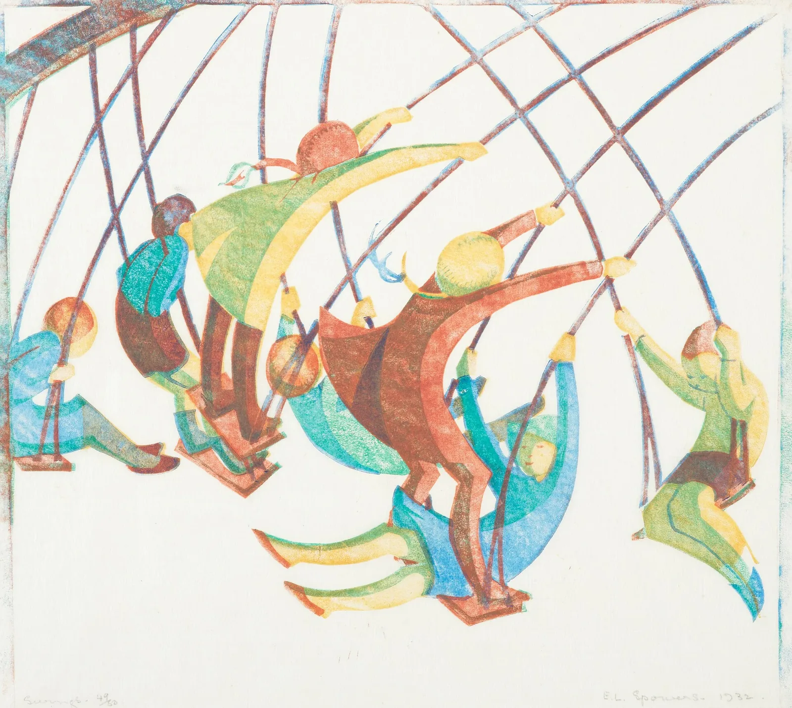
Ethel Spowers’s Swings
Ethel Spowers's *Swings* makes motion the subject of a still image. The work is dated 1932 and identified as a linocut in Te Papa's collection record. The National…
4 min read