
The Print Field / Essay 23
Fons Heijnsbroek’s Linocut Still Life
The Commons record describes this 1988 linocut as an untitled abstract still life by Dutch artist Fons Heijnsbroek. Those details are enough to guide a first…
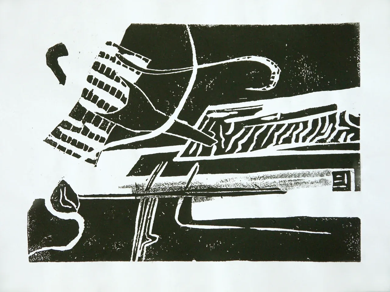
An untitled still life in cut lines
The Commons record describes this 1988 linocut as an untitled abstract still life by Dutch artist Fons Heijnsbroek. Those details are enough to guide a first reading without inventing a story about the artist's intent. “Still life” names a subject tradition; “abstract” describes a departure from literal depiction; “untitled” warns us that the image does not provide a verbal key. The print asks the viewer to study relationships among shape, edge, and empty space rather than decode a supplied title.
Linoleum is a relief-printing surface. A cutter removes material from the areas meant to remain unprinted; ink is applied to the parts left standing, and pressure transfers the raised design to paper. The process makes negative space tangible. A carved channel becomes a line of paper, while an uncut ridge can hold the ink. In an abstract still life, that exchange can turn a recognizable object into a set of planes or contours.
What “still life” contributes
A still life is often associated with arranged objects: vessels, fruit, flowers, tools, or other things chosen to be observed. But the label does not require photographic realism. An artist can simplify an arrangement until only its balance, weight, and relations remain. A dark block can imply a solid mass; a curved cut may indicate a vessel's rim; a blank interval can separate objects without drawing their outlines. Because the print is abstract, an interpretation should remain a proposal rather than a claim about the artist's exact intention.
The medium reinforces that openness. A linocut is built through subtraction. Each cut changes what can receive ink, and broad passages of dark or light can emerge from a limited set of decisions. The result can look spontaneous, yet the carved surface records deliberate choices: what to keep, what to remove, and how a mark will print in reverse. The material does not guarantee a particular style, but it gives the artist a clear relationship between gesture and result.
Follow the edges before naming objects
One way to read an untitled image is to postpone identification. Follow a line from one edge to the next. Notice where a shape opens or closes. Ask which areas feel heavy and which seem to recede. Then test possible object readings against the composition: does the form behave like a bowl, a leaf, or a shadow? If several possibilities fit, that ambiguity may be part of what the abstraction allows.
Reproductions can flatten the physical surface. A printed linocut has paper texture, ink density, and small variations that may not survive a web image. The online file is an aid to viewing, not a substitute for an examined object. The file description identifies the medium, year, and maker, and records an approximate print size of 27 by 19 centimetres and a limited edition of five. It does not provide a conservation report or a complete carving sequence. Edition information should be taken from those descriptive fields rather than guessed from the thumbnail.
The cut is both drawing and removal
Drawing usually adds a mark to a surface. Relief carving removes material so that the remaining surface can print. This reversal changes planning. A line cut into the block can appear as a light channel in the final impression. A broad uncut region may print as the dominant dark. The artist must envision the image as both a block and a reversed print, anticipating which parts will carry ink after each cut.
That mental shift helps explain why simple shapes can be technically demanding. The printmaker has to keep important ridges strong enough to survive inking and pressure while cutting away areas that should remain blank. A narrow bridge can break. An unprinted channel may appear narrower if excess ink spreads into it; the reproduction can also soften an edge. Proofs reveal how the carved surface behaves; the artist can then adjust the block if the edition permits.
Give an interpretation a visible test
An untitled abstract still life invites associations, but a useful reading should explain what makes an association plausible. Instead of naming a dark shape as a vessel and stopping there, look for the relation that sustains that reading: enclosure, a rim-like curve, a supporting base, or adjacency to another form. If those features are absent or contradicted elsewhere, the identification should weaken. The interpretation becomes something another viewer can examine, rather than an authority supplied by the writer.
An alternative is to describe weight without identifying objects. Compare enclosed and open shapes, repeated and isolated edges, or dense marks and larger intervals of paper. This vocabulary can explain how a still-life arrangement feels organized even when individual things remain ambiguous. It also avoids borrowing the artist's biography to provide a story that the image has not established. The Commons description supplies maker, date, and medium; the argument about balance belongs to the present reading.
That distinction gives abstraction a practical critical value. It lets viewers move between recognition and formal relationships while asking what each reading explains. The relief process matters because every ink-bearing region depends on material left on the block, while a cut opens another interval in the impression. Heijnsbroek's work can thus be approached as an arrangement of competing ways to recognize form. The question is not which hidden object solves the picture, but which proposed reading accounts for the greatest number of visible relationships.
Further reading
Sources & records
Linked records provide object descriptions and historical context. Comparisons, close readings, and explicitly hypothetical examples are editorial analysis. This essay was revised on 22 October 2026; it does not report first-hand workshop research. The image source and license appear in its caption.
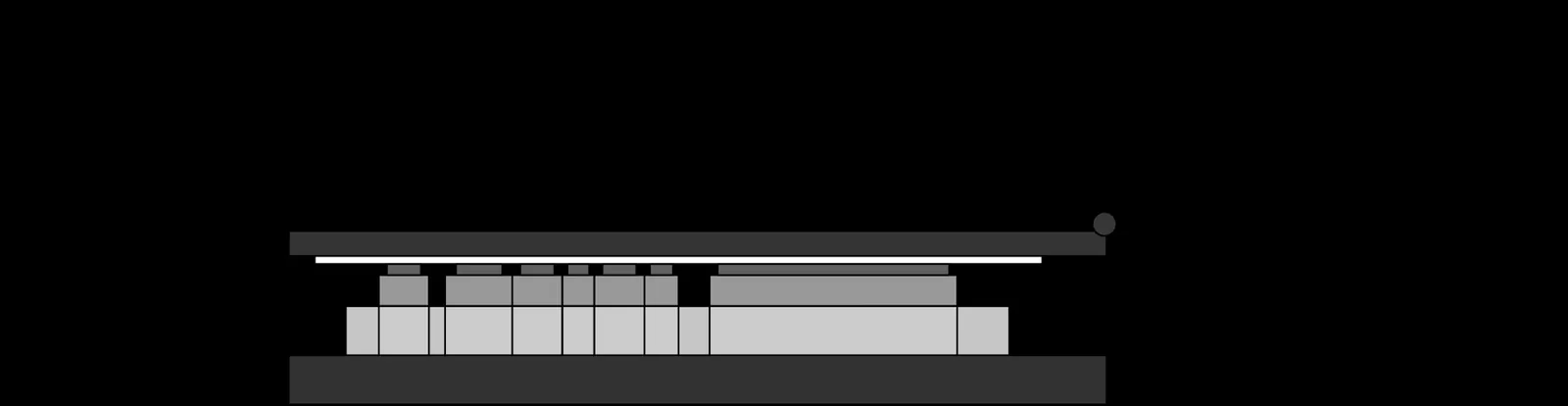
Flatbed Letterpress Anatomy
A flatbed letterpress diagram turns an industrial machine into a set of relationships. The bed holds the locked type or relief forme. The ink system prepares the…
5 min read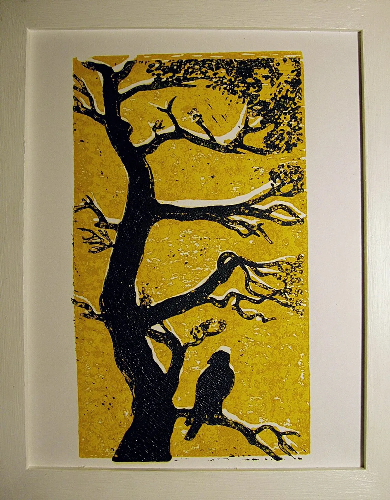
Registration in a Two-Colour Linocut
A two-colour linocut is not simply a black-and-white print with a second ink added at the end. Each color depends on a carved surface, an inking decision, and a…
5 min read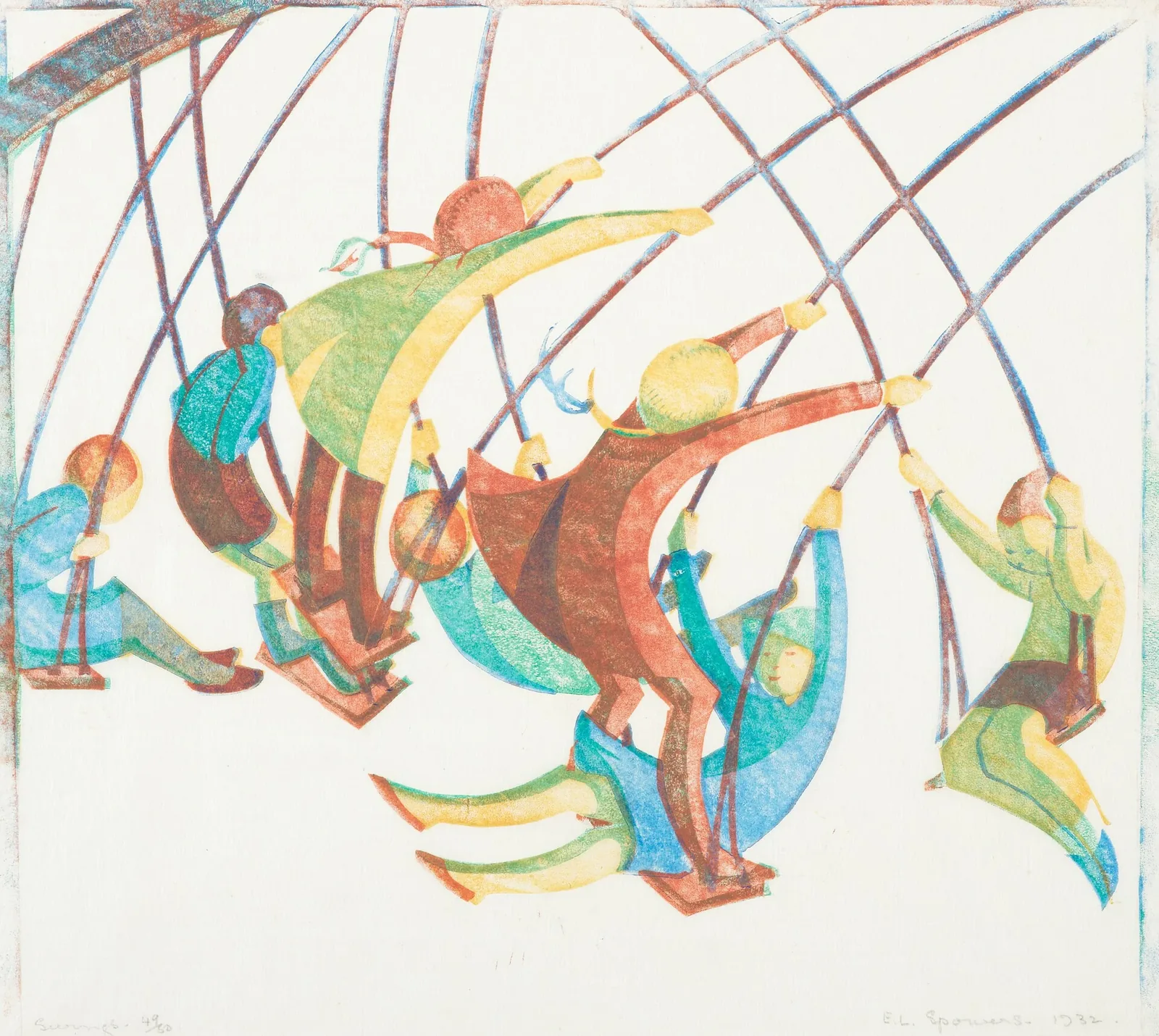
Ethel Spowers’s Swings
Ethel Spowers's *Swings* makes motion the subject of a still image. The work is dated 1932 and identified as a linocut in Te Papa's collection record. The National…
4 min read