
The Print Field / Essay 25
Ethel Spowers’s Merchants, Port Said
Ethel Spowers's *Merchants, Port Said* is a linocut dated 1932. The National Gallery of Australia records that its colour impression was printed from six blocks,…
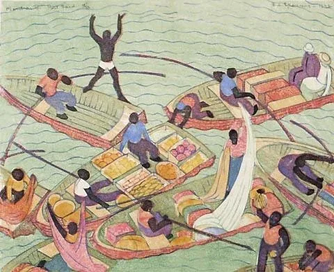
Six blocks behind one printed scene
Ethel Spowers's Merchants, Port Said is a linocut dated 1932. The National Gallery of Australia records that its colour impression was printed from six blocks, using light yellow ochre, light cobalt blue, darker yellow ochre, light green, pink, and a light black. That production detail turns the image into a study of coordination. What appears to the viewer as one scene is the result of several separately prepared surfaces brought into relationship on paper.
The work's title names a place and a subject, but the print's material construction offers another route into it. Each block holds part of the image. Each pass contributes a color. The paper must meet those surfaces in planned positions so that boundaries stay controlled and forms align. The collection record's six-block description is specific to this artwork; it should not be generalized to every linocut by Spowers or every colour print of the period.
Color is built in passes
Linocut is relief printing. The printmaker cuts away areas of linoleum, leaving raised surfaces to hold ink. In multi-colour work, separate blocks can carry different areas or colors. A sheet is passed through the printing process more than once, and the alignment of each impression matters. Registration is the effort to return the paper to a consistent position for every pass.
The six-block record suggests how much planning the image required. A palette is not simply a list of hues; it is a set of relationships between printable surfaces. Some colors may define the broadest forms; others may bring detail forward or create contrast. A viewer can examine where a color touches another and how shapes remain legible when several passes overlap. The exact sequence of printing is not given in the cited collection description, so this account does not assign one.
The place is named, not fully narrated
The title Merchants, Port Said anchors the subject geographically. The work's record identifies its subject and medium, but a title alone cannot tell us which people are depicted, what they are selling, or what the artist observed while making the image. Those details should come from the work itself, contemporary documents, or an artist's record, not from a viewer's assumptions about a port city.
That restraint does not make the scene less readable. A viewer can describe visible objects and arrangements, compare the composition with the title, and notice how color steers attention. The work may evoke exchange and movement, but such language should be presented as an interpretation of what is visible rather than as a documented account of the depicted merchants' lives. The print is an artwork, not a census or field report.
A print is also a record of making
Six blocks leave a conceptual map of the production process. Each block had to be designed in relation to the others. The printmaker needed to consider which areas would remain unprinted, how colors would meet, and where a small registration error would be noticeable. A proof could reveal whether forms aligned and whether the chosen sequence produced the intended effect. Because color accumulates across passes, changing one block can alter the reading of the entire image.
The paper itself participates. It must withstand handling and return accurately to the printing position. Ink has to transfer from each surface without making the sheet too wet or obscuring earlier colors. The artist's decisions about pressure and inking influence the final impression. These are general features of multi-colour relief printing; a particular print's paper and exact press setup require object-level documentation.
Looking at color without flattening it
Digital reproductions can distort both hue and surface. Screen calibration affects whether a yellow appears warm or pale; compression can soften a crisp carved edge. The National Gallery's catalogued color names help readers orient themselves, but an in-person view or a high-quality institutional image is needed for careful color comparison. The list identifies the inks recorded for the work; it is not a color profile of every surviving impression.
The six colors can be read as an architecture. Broad regions create a framework, while smaller passages bring contrast. The light black may function differently from a dense, dominant black; the two yellow ochres can separate foreground and background without relying on outline alone. These are observations that can be tested against the image. They should not be mistaken for a documented account of Spowers's exact intention unless the artist's own statement confirms it.
Six blocks do not give a six-step viewing order
The Australian Prints + Printmaking record supplies a production fact: six blocks and six named inks. That count should not be confused with the number of colors a viewer can distinguish on a screen, nor does it reveal the order in which the blocks were printed. Overlap, differences in ink coverage, paper, and reproduction can make the visible result more complicated than a simple list of six isolated swatches.
The useful analytical question is what each color contributes to recognition. A broad field might establish a larger region, while a smaller contrast could make a figure or boundary easier to read. These are possibilities to test against the reproduction, not a reconstruction of the original blocks. The catalogue identifies the materials of coordination; the viewer still has to explain how their combined effect makes the scene legible.
Compare this with Spowers's five-block Lonely Farm. The difference in count does not rank one image as more skillful or more complex. A block can carry a large uninterrupted field or many small separated shapes; the number alone says little about its cutting difficulty. What it establishes is a different division of the image among printing surfaces. That is the distinctive insight here: production data can sharpen close looking without becoming a substitute for it. Six blocks tell us that the scene was materially distributed, while the composition shows how those separate contributions become one readable encounter with the named place and subject.
Further reading
Sources & records
Linked records provide object descriptions and historical context. Comparisons, close readings, and explicitly hypothetical examples are editorial analysis. This essay was revised on 22 October 2026; it does not report first-hand workshop research. The image source and license appear in its caption.

Flatbed Letterpress Anatomy
A flatbed letterpress diagram turns an industrial machine into a set of relationships. The bed holds the locked type or relief forme. The ink system prepares the…
5 min read
Registration in a Two-Colour Linocut
A two-colour linocut is not simply a black-and-white print with a second ink added at the end. Each color depends on a carved surface, an inking decision, and a…
5 min read
Fons Heijnsbroek’s Linocut Still Life
The Commons record describes this 1988 linocut as an untitled abstract still life by Dutch artist Fons Heijnsbroek. Those details are enough to guide a first…
4 min read