
The Print Field / Essay 26
Ethel Spowers’s The Lonely Farm
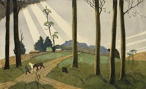
Ethel Spowers's *The Lonely Farm* is a colour linocut dated 1933. The Australian Prints + Printmaking database records it as printed from five blocks in grey, blue,…
Five blocks and one named place
Ethel Spowers's The Lonely Farm is a colour linocut dated 1933. The Australian Prints + Printmaking database records it as printed from five blocks in grey, blue, black, yellow ochre, and green, with a printed image measuring 19.8 by 31.8 centimetres and an edition of 50. It also identifies the scene as the Spowers family's holiday farm, “Harfra,” at Harkaway, Victoria. These particulars turn a landscape image into a documented print object and give its title a place-specific meaning.
Five blocks mean five separate relief surfaces were part of the image's construction. In linocut, the printmaker cuts away material so that raised areas receive ink. Colour printing from more than one block requires the sheet to meet each surface in a controlled position. The database supplies a color list and block count, but not the exact order of printing. The final impression should not be used to invent a sequence that the technical record does not provide.
The setting is a family holiday place
The phrase “lonely farm” can invite a reader to imagine isolation as a general mood. The catalogue's subject description is more precise: the scene represents the family's holiday farm at Harkaway. That context brings the title into contact with a named rural location without claiming that the image is a documentary photograph. A linocut is a constructed view. Its shapes and colors are chosen, carved, and printed, and those choices shape how the place is experienced.
A landscape can compress many observations into a small number of lines. A roof, field boundary, tree, or distant ridge may be simplified so it remains clear after printing. The use of five colors makes the image's planes and edges especially important. The catalogue names the colors, while the viewer can test how those colors divide the space and draw attention to particular features. Interpretations about mood should remain grounded in the visible work rather than presented as facts about Spowers's state of mind.
Relief printing makes the block count visible
The database's five-block description is one of the most useful pieces of evidence about the work's production. Each block needed to be designed in relation to the others. The artist planned which areas would print in each color, which edges had to align, and where the paper would remain unprinted. A multi-block linocut is not a single carved drawing colored after the impression; its colors are built into separate printable surfaces.
Registration becomes part of the artwork's structure. If the sheet shifts, boundaries can separate or overlap in unexpected ways. The importance of precision depends on the design: a broad shape may tolerate a small shift, while a narrow contour will expose it. A proof can show whether the arrangement works, but the documented entry does not describe Spowers's proofing method for this specific edition. It is safer to describe the general requirements of multi-block relief printing than to assign an undocumented studio routine.
The edition number also belongs to the record. “Edition of 50” indicates that the catalogue identifies a planned edition of that size. It does not mean that every impression is identical in every detail, nor does it tell us which individual print is being reproduced in an online image. Paper, ink, pressure, and handling can leave differences among impressions. Collection records may identify a particular copy through an accession number or provenance entry.
Reading the image through its layers
Start with the broadest fields of color. Which region establishes the ground? Where does the darkest ink gather? Do the colors describe separate objects, or do they create an overall rhythm across the landscape? These questions make the print's material structure available to visual analysis. The viewer can distinguish an observed feature—such as a green field—from an interpretive claim about its significance.
Digital images can conceal paper texture and distort hue. The catalog's color names provide a reference point, but a screen does not guarantee an exact match to the original impression. The dimensions in the database are also useful: at roughly twenty by thirty-two centimetres, this is a compact print whose carved marks must carry the landscape without the scale of a large canvas. The size helps frame how the viewer encounters detail.
An edition count and a printing sequence answer different questions
The Lonely Farm's catalogue records five blocks, an image size, and an edition of 50. These figures describe different scales of the object. Five concerns the printing surfaces contributing to the image. The dimensions concern the area of the printed image. Fifty concerns the catalogued edition. None of the three is a direct measure of time spent carving or proofing, and multiplying them would not recover the artist's workload.
This separation makes a more useful comparison possible. A reader can compare the image's proportions with the way a landscape is organized, then consider how its five recorded inks divide the scene. The named farm gives the subject a documented setting, but it does not determine how the artist transformed that setting into printable shapes. Descriptive accuracy and compositional organization remain distinct questions. A catalogue can identify Harfra without making the print a measured survey of its buildings and land.
The difference matters when an online reproduction appears larger than the physical work. Enlarging it helps inspect edges but changes the experience of its scale. Returning to the recorded 19.8 by 31.8 centimetres reminds the reader that a relatively compact impression holds a landscape assembled through repeated contacts with paper. The article's interpretation is that the work joins two kinds of coordination: dividing the scene among blocks and bringing those contributions together within a limited printed field. Its edition record adds a history of intended repetition without claiming that every impression survives or looks identical.
Further reading
Sources & records
Linked records provide object descriptions and historical context. Comparisons, close readings, and explicitly hypothetical examples are editorial analysis. This essay was revised on 22 October 2026; it does not report first-hand workshop research. The image source and license appear in its caption.

Flatbed Letterpress Anatomy
A flatbed letterpress diagram turns an industrial machine into a set of relationships. The bed holds the locked type or relief forme. The ink system prepares the…
5 min read
Registration in a Two-Colour Linocut
A two-colour linocut is not simply a black-and-white print with a second ink added at the end. Each color depends on a carved surface, an inking decision, and a…
5 min read
Fons Heijnsbroek’s Linocut Still Life
The Commons record describes this 1988 linocut as an untitled abstract still life by Dutch artist Fons Heijnsbroek. Those details are enough to guide a first…
4 min read